Client: Brandon Disc Gold Club
Location: Manitoba, Canada
Scope: Logo Design
Location: Manitoba, Canada
Scope: Logo Design
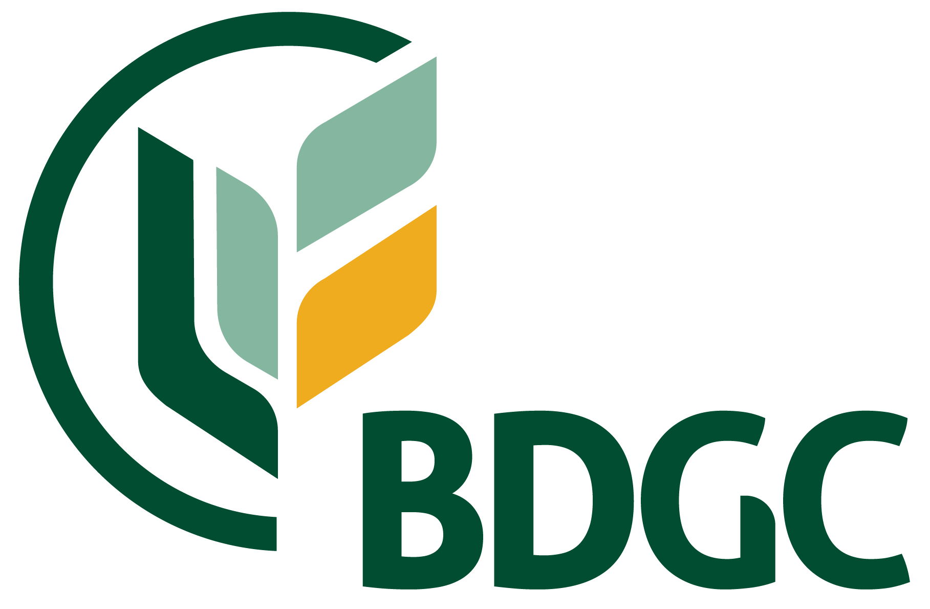
The Brandon Disc Golf Club approached me to design a new logo that would reflect their identity while standing apart from the typical disc golf branding. The goal was to create a modern yet timeless design—something clean, versatile, and suitable for a wide range of applications, including discs, embroidery, signage, and digital use.
While they were open to creative direction, one guideline was clear: no generic disc golf baskets. They wanted something distinctive that avoided clichés.
I responded with a concept that subtly nods to the sport by incorporating a deconstructed basket, paired with a stylized wheat icon—a reference to Brandon’s nickname, Wheat City. The design uses simplified, geometric forms to ensure clarity and scalability across all mediums.